Design and Marketing Project
Project background
BDS (Business Document Solutions) is a Norfolk, Virginia based printing company that recently changed owners. Though successful and with a solid and consistent customer base, it is fair to say the company's image and online presence were dated, having little to no update since their initial creation.
.png)
.png)

My role
I was brought in to help in modernizing BDS' digital and physical marketing efforts in tandem with the new owner's desire to appeal to and reach a wider client base. The key areas of focus I worked on were:

Drafting the new look website

Writing new SEO conscious website copy

Creating new marketing materials

A new look
I then crafted the website copy, incorporating keywords in a natural, seamless way without overstuffing and ensured that the HTML tags were properly structured for optimal readability. Below are some screenshots of the final website design using the new copy.
Business Cards - The business cards were revamped with a fresh design. The front features the logo, name, and new slogan, while the back includes contact details, the address, and a QR code linking to the website. Both sides incorporate the wave motif for a cohesive look. I also made versions for BDS' Vice-President, Production Manager and Office Manager.
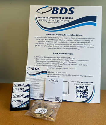

Notepads - the new designed notepads, whether taken away as a single note or gifted to customers as a whole pad, feature the print shop's address and the new website's QR code

Cookie stickers - BDS is known for its cookies, shared at business functions, sponsorships, and with customer orders. The cookie stickers double as playful business cards, creating a memorable impression on potential clients. These and other materials showcase the new slogan, "Printing, Scanning, Copying, and cookies," which provides a concise summary of the business while also serving as a fun conversation starter.
Website redesign
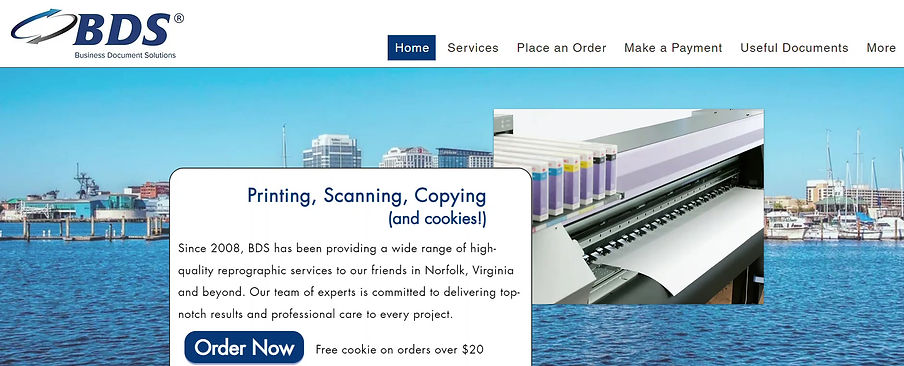
The first area the new owner wanted addressed was the company's website. It was originally designed by an external company in 2014 and subsequently never updated visually (and it showed). I drafted the new look for the website on Wix. The new owner wanted a cleaner, more modern design, predominantly white with blue for emphasis.

After this I designed the rest of the homepage which can be viewed below. The homepage showcases BDS' services, features client testimonials, and emphasizes the company's quick job turnaround time with each section providing alternate navigation options. The BDS blue CTAs are sharp and dynamic and guide visitors to ordering or requesting more information.
Next, I designed the service pages showcasing the different solutions BDS provides. The video below shows top navigation, now much more streamlined than the original website design, as well as a service page navigated to from the homepage.

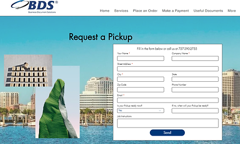
Below are some more examples of page redesigns.

Make a Payment
Request a Pickup
The designs were handed over to a web design specialist, who refined them and updated the original WordPress website to reflect the new look.
BDS' new look website can be viewed here.

A new voice
SEO Copywriting
My next task was to revamp the website copy. The original content felt cold and uninspiring, and the new owners wanted a warmer, more informative tone. The website was also struggling with low visibility in search results, leading to minimal clicks and engagement, so SEO optimization became a key focus.
I used Semrush to conduct keyword research, focusing on terms related to printing, scanning, and copying, as well as keywords emphasizing fast turnarounds, professional and reliable service, high-quality work, and local accessibility.


Something to take home
Creating Marketing Materials
Finally, I took on the task of creating new marketing materials for the print shop, where customers often drop by and take something with them and for staff to give out at corporate events or with job deliveries. The old designs had become quite dated, and the new owner was looking for a fresh, fun, and stylish update. The goal was to align the materials with the white and blue aesthetic of the revamped website, incorporating the new, engaging wording. I also introduced a wave motif, inspired by the shop’s location in Norfolk, famed for its harbor. The result is a cohesive, modern look that reflects the shop’s coastal roots and invites customers to connect with the brand.
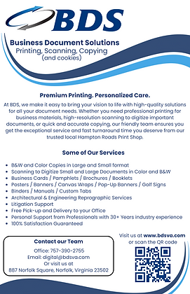
Small and large promotional piece - A5 takeaway pamphlets and a large in-store display. These pieces introduce BDS as a company dedicated to providing high-quality solutions, highlight their range of services, and include essential contact information. Each also features a QR code that directs customers to the newly designed website for easy access to more details.